Your Ad Here
Showing posts with label jquery plugin. Show all posts

2 January 2013

jQuery tools overlay with queue integration

Few days back I had one problem that is related to standard jquery .overlay() method and multiple messages on the page.

Say you have two different messages that you want to display in an overlay, and call multiple methods during page load (sometimes it's hard to tell how many messages you will get as they can depend on site mode, user status and etc.). Once you will call $(...).overlay() it will try to open both messages and can break background (it just dissapears) can show messages that will overlap each other and that sucks! No matter what is behind the page and how fast it works if UI sucks...

To avoid this I simple extension for standard $.overlay() method that will just enqueue messages and will show them in order you loaded.


Download Now
 

It also has a support to display how many messages are in the queue right now, to use it bind this event to body:

$("body").bind("overlayCount", function(event, count)
{

   ...
}

You can use it for tips on your web page and show multiple images for user as a guide on how to do something.
 It won't affect initial .overlay behavior, so enyoj!


11 November 2011

Cool HTML 5 select with jquery and css styles (rounded corners and gradient)


Demo

Click image to view Live Demo

Contents

  1. How to use
  2. Settings description
  3. Download

How to use

  1. Add reference to jQuery library to your page (I'm using this one).

  2. Add reference to wwselect.css to <head> section (<link rel="Stylesheet" type="text/css" href="wwselect.css" />).
    Note that css requires 2 images for arrows that can be found in archive. Don't forget to update urls in css if you move them to another directory.

  3. Add reference to wwselect.min.js (<script type="text/javascript" src="wwselect.min.js"></script>).

  4. Init plugin code.
    $(window).load(function(){ {$("select").wwselect(); }); - to update all selects on the page
    $(window).load(function(){ {$("#example2").wwselect(options); }); - to update all single select with some options
    Take a look at demo page source for more details.


Settings description

Setting name Description Example
width Indicates maximum width of generated select. When this value is exceeded option text will be minified. Any number greater then 0.
$(<selector>).wwselect({ width: 100 });
height Indicates maximum height of generated list of options. When this value is exceeded vertical scroll will appear. Any number greater then 0.
$(<selector>).wwselect({ height: 100 });


Download

Download page

See demo.html for more details.

!!! Note: Some browsers may have invalid gradient and rounded corners handling!!!

Like this article?


26 May 2011

HTML 5 Page Menu Navigation helper


Menu example

Click image to view Live Demo

Code:


The default code to show this menu is following:
$(document).ready(function() {
$.WwAdvMenu.Create({ location: "top", openDefault: true, innerHtml: TEST TEXT" });
});

Back to top

Plugin options

Setting name Description Available values Default value Example
location location of menu on the page "top", "right", "bottom", "left" "top" $.WwAdvMenu.Create({ location: "bottom" ..
customOffset Custom offset that will be set to menu if default location is wrong or doesn't fit your site { top: "1px", right: "1px", bottom: "1px", left:"1px" } null $.WwAdvMenu.Create({ customOffset: {top: 0, right: 15} ..
buttons Array of buttons that will be shown on menu, Read about creating buttons null $.WwAdvMenu.Create({ buttons: [ { text: 'message', click:function() { alert('execute custom code here'); } }, ..
innerHtml HTML that will be shown instead of buttons any html code null $.WwAdvMenu.Create({ innerHtml: "<span style='padding:20px; display:block;'>TEST TEXT</span>" ..
imagePath Path of directory containing images Virtual directory path "" $.WwAdvMenu.Create({ imagePath: "../images/"...
dynamicContent Variable that forces menu to create another container for dynamic html, must be set to true when displaying something inside menu true/false false $.WwAdvMenu.Create({ dynamicContent: true...
maxHeight Maximum height of inner menu container size in pixels 460 $.WwAdvMenu.Create({ maxHeight: 500...
openDefault Setting to open menu by default true/false false $.WwAdvMenu.Create({ openDefault: true...
Back to top

Callbacks

Event name Description Example
onShowMenu Callback function that is called when inner menu is opened $.WwAdvMenu.Create({ onShowMenu: function() { alert('opened'); } ..
onHideMenu Callback function that is called when inner menu is closed $.WwAdvMenu.Create({ onHideMenu: function() { alert('closed'); } ...
Back to top

Public Methods

Method name Description Arguments Example
Create Method that creates menu options - ww menu options
var opt = { location: "top", openDefault: true, innerHtml: TEST TEXT" };

$.WwAdvMenu.Create(opt);
HideMenuContent Hide inner menu content null $.WwAdvMenu.HideMenuContent();
ToggleContent Hides or displays inner menu content show: true/false $.WwAdvMenu.ToggleContent(false);
UpdateContent Update inner content HTML (see last button in example) HTML $.WwAdvMenu.UpdateContent("<span style='padding:20px; display:block;'>Some loooong data here</span>");
Show Show entire menu
$.WwAdvMenu.Show();


Hide Hide entire menu
$.WwAdvMenu.Hide();


Back to top


Buttons

Code:


Every single button is an object with inner options. The list of available options is following:


var button1 = { id:null, imagePath: null, text: 'msg', className:'', href:null, click:null, dataProvider: function(callback) {}, externalUrl:null };


Button Options


Options Description Available values Default value Example
id Custom button id Custom ID null (will be auto generated) var button1 = { id:"myid" }
imagePath Image that will be displayed inside button Image path null var button1 = { imagePath:"/images/1.jpg" }
text Button's text, will be used if no image path is presented text "" var button1 = { text:"my button" }
className Custom button class class name "" var button1 = { className:"myClass" }
href Url for the button url null var button1 = { url:"http://www.webworld-develop.blogspot.com/" }
click Custom button click event function null var button1 = { click: function(e) { alert('my button was clicked'); }
dataProvider
Custom function that returns HTML that will be displayed in inner menu container. (Third button in example).


This function can load HTML dynamically and run callback with results.
function(callback){} null var button1 = { dataProvider: function(callback) { callback("Hmmm...<br />What can be here?<br /><strong>Maybe some long bold text?</strong>"); } }
externalUrl Page url that will be loaded in an IFrame (see second button for details). url null var button1 = { externalUrl: "http://www.webworld.lv/" }

Creating buttons

Code:


First you need to do is to create an array of buttons.

var myBtns = new Array();
myBtns.push({ text: 'button1', href:"http://www.webworld.lv" });
myBtns.push({ text: 'button2', href:"http://www.sobak.lv" });
myBtns.push({ text: 'button3', click:function() { alert('button 3 clicked'); } });
myBtns.push({ text: 'button4', externalUrl:"http://webworld-develop.blogspot.com/" });

Easier way to do this is following:

var myBtns = [{ text: 'button1', href:"http://www.webworld.lv" }, { text: 'button2', href:"http://www.sobak.lv" }];

Then pass created buttons as option when creating menu:

$.WwAdvMenu.Create({ buttons: myBtns });

Back to top


Download


Get HTML 5 navigation plugin now!

See index.html for more details.

Back to top


Like this article?


10 May 2011

Cool HTML 5 styled buttons (shadow and rounded corners) with animation


!!! Note: This works only in HTML 5 compatible browsers!!!


Examples

Click image to view Live Demo

Back to top

Plugin settings

Setting name Description Available values Default value Example
<selector> ($(".wwbuttons>a")) + code
animationSpeed Speed of buttons hover animation (same setting as jQuery) "fast",
"normal",
"slow",
100,
...
"fast" .wwbutton({ animationSpeed: "slow" });
animationSize Number of pixels for button animation any number (including negative) 12 .wwbutton({ animationSize: 15 });
Opacity settings
normal Opacity level for normal button state value from 0.0 to 1.0 0.8 .wwbutton({
opacity:
{
normal:1,
hover: 0.45,
disabled: 0.05
}});
hover Opacity level for hover button state 1
disabled Opacity level for disabled buttons 0.2
Back to top

Events

Event name Description Example
<selector> ($(".wwbuttons>a")) + code
over Callback function that is called after mouseover animation stops .wwbutton({ over: function(){ alert('mouse over'); }});
out Callback function that is called after mouseout animation stops .wwbutton({ out: function(){ alert('mouse out'); }});
click Custom click event .wwbutton({ click: function(){ alert('button clicked'); }});
Back to top


Methods

Method name Description Example
<selector> ($(".wwbuttons>a")) + code
toggle Enables/Disables button.
Pass true as second argument to enable or false to disable.
.wwbutton('toggle', true);
Back to top


Download


Get buttons plugin now!

See Demo.html for more details.

Back to top


Like this article?


21 April 2011

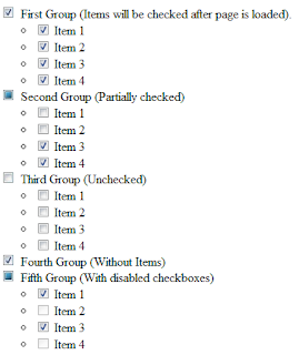
Small and quick Tri-state checkbox jquery plugin.

Contents

  1. Demo
  2. How to use it?
  3. Options
  4. Download

Demo


Click image to view Live Demo


Plugin code and usage


How to use:
1. Download plugin code.
2. Add jQuery reference.
3. Add style reference "tri-state-checkbox.css" to your <head> section.
4. Add plugin file.

You will get something like this in result:


<head>
    ...
    <link rel="stylesheet" type="text/css" href="tri-state-checkbox.css" />
    <script type="text/javascript" src="https://ajax.googleapis.com/ajax/libs/jquery/1.5.2/jquery.min.js" ></script>
    <script type="text/javascript" src="tristatecheck.min.js" ></script>
    ...
</head>

5. Add a function that initializes checkboxes.

For example:

    <script type="text/javascript">
        $(document).ready(function(){
                $(".mainCheckbox").each(function(){
                        $(this).tristate({
                            children: $(this).parent().find("ul>li>input[type='checkbox']"),
                            classes: { checkbox: "customcheck", checked: "customcheckfull", partial: "customcheckpartial", unchecked: "customchecknone" }});
                    });
            });
    </script>


Options:
This is very simple plugin so it has only 2 options:
classes
checkbox Main css class for new elements that will replace checkbox.
checked Css class for checked state.
partial Css class for partially checked state.
unchecked Css class for unchecked state.
children jQuery selector for childrent (level 2) checkboxes.

You can see how to use them in example above.

Download:
Download


Like this article?


6 September 2010

Rounded Corners Techniques

One more interesting article.
A lot of people are trying to get rid of squares in their web-design and there are a lot of ways to do this:

  1. Use images with CSS
  2. Use CSS only
  3. Use JavaScript
  4. RoundedCorners control from AJAX controls library
Let's pass through all of them.


Rounded corners with images and CSS.


Easiest way is to draw an image with rounded corners and set it as an element background. You will always know that this element will have correct background in all browsers.
To do this we need following things:
  1. Some images:
        
  2. This html code:
    <div class="topDiv imageDiv">&nbsp;</div>      
    <div class="middleDiv imageDiv">My text goes here</div>      
    <div class="bottomDiv imageDiv">&nbsp;</div>

  3. And simple CSS styling:
    .imageDiv
    {
        width:200px;
        float:left;  
        clear:left;
    }

    .topDiv
    {
       background-image:url(top.png);
       height:13px;
    }

    .middleDiv
    {
       background-image:url("middle.png");
       color:#FFFFFF;
       font-family:verdana;
       font-size:14px;
       padding:20px 0;
       text-align:center;
    }

    .bottomDiv
    {
       background-image:url(bottom.png);
       height:17px;
    }
This is an example of working code:

My text goes here
It can be done very fast, but imagine how much time will it take to load images for 5...10... or even more different boxes with rounded corners. More images you have - more time visitor will wait until page loads completely.


To decrease images count we can go to next step:

Rounded corners with CSS (without any images).


There is one way to create rounded corners for Firefox without any additional elements, just add style="-moz-border-radius: 15px;" to target element and it will have pretty border around. Cool, but it works only with FF (see bellow).
Works only if Firefox
So, what to to with other browsers (IE, Google Chrome and etc.)? It's a bit tricky, but nothing is impossible. As everyone knows every picture consist of pixels, so we can create custom elements that will be those missing pixels for rounded corner. 
We need only two things:

  1. HTML:
    <div id="Div3" class="example" style="background-color:#FFF;">
    <div class="t5"> </div>
    <div class="t3"> </div>
    <div class="t2"> </div>
    <div class="t1"> </div>
    <div class="t1"> </div>
    <div id="contentElmenent">My content goes here.</div>
    <div class="t1"> </div>
    <div class="t1"> </div>
    <div class="t2"> </div>
    <div class="t3"> </div>
    <div class="t5"> </div>
    </div>
  2. Styles:

    #Div3 { width:200px; }
    #Div3 #contentElmenent
    {
    text-align:center;
    background-color:#CCCCCC;
    text-align:center;
    padding:30px 0;
    font-size:14px;
    font-family:Verdana;
    height:auto;
    }
    #Div3 div
    {
    background-color:#CCC;
    font-size:1px;
    height:1px;
    }
    #Div3 .t5 {margin:0 5px;}
    #Div3 .t3 {margin:0 3px;}
    #Div3 .t2 {margin:0 2px;}
    #Div3 .t1 {margin:0 1px;}
The result is following:
My content goes here.
 I experimented a bit to get an element with border, but it looks horrible :(
My content goes here.
It's wasn't really easy and now my HTML has a lot of garbage, so I had an idea about moving this functionality to script, to add those fields dynamically... And I found one plugin for JQuery:

Creating Rounder Corners JQuery (Javascript)


This plugin called "JQuery Corner". It's demo page and download link is here. It has possibility to show different styles for element corners and it looks like this:

My content goes here.

Cool, isn't it? 
And all this is done by a single function :) Just need to add following code:

    <script type="text/javascript">
        $(document).ready(
            function () {
                $("#jqueryDiv").corner("round 10px").parent().css('padding', '4px').corner("round 12px")
            });
    </script>
It's amazing but it works almost in all browsers (at least in popular), so I think it's the best solution. So I'm going to use this plugin in my pages. But it the begining :) of this post I promised to write about all methods :), so few words about AJAX.

RoundedCorners control from AJAX controls library


People who uses .NET as development platform can also use ajax controls library. It can be found here. It really has a lot of useful controls (calendar, autocomplete and etc.), but all of this is server side and it can't be used outside form element.
Rounded corners control demo page is here. The idea is same, it creates new <div> element around target control and it makes it look like curve. It also has a lot of options that will help you to quickly customize your container.

So, I think that's all :) Now I have to spend some time implementing all the things that I found, and I hope my site will start working soon.